Hello CSS
CSS stands for Cascading Style Sheets
HTML marks up the semantics
CSS changes the presentation
Benefits of using style sheets are huge
- More control
- Less work/typing
- Easier to change
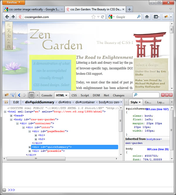
A great example of this can be see here -
http://csszengarden.com/
Note all of the pages here have the
same HTML. All the differences are created with CSS.
Tools
There are some really useful tools for working with HTML and CSS.
I'm going to show you how to use firebug and firediff.
First you'll need to download the firefox browser.
Go to http://csszengarden.com/ and open firebug by hitting F12 or clicking on the firebug icon.
Now you can see all the HTML and CSS for this page.
Note that as you mouseover the different elements, that element is highlighted in the page.
--Wow--
Now what if you want to use it on your app?
There are two ways:
Open your page in a browser
Which works great, but what if you want to see what it's actually going to look like in the emulator?
Weinre
PhoneGap has made a weinre server to let you do firebug-like things on your phone.
Go to http://debug.phonegap.com/
You can put any unique GUID. Using your package name is a good idea because this should be unique anyway.
Enter your GUID.
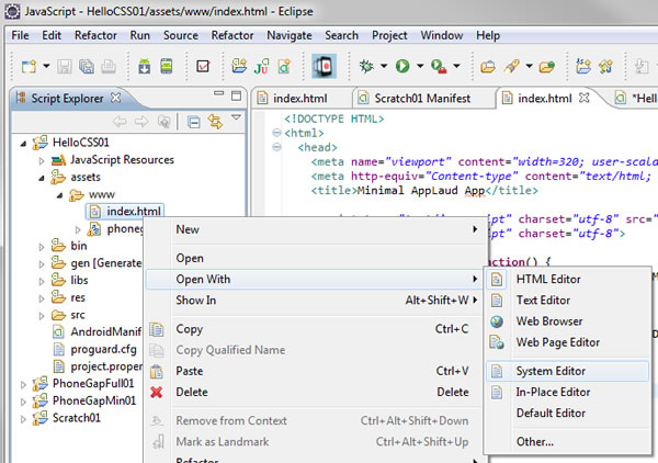
Copy the script into index.html.
Run your app.
Go to the provided link.
Et viola! - You have firebug like capability in your emulator (or on your phone!!!)
CSS
The basic format for CSS is:
selector
{
  property: value;
}
Selectors
CSS is specified with selectors
You can specify styles by:
- element, e.g. <body>, <p>, <div>, etc.
- id, e.g. <div id="n123"></div>
- class, e.g. <div class="menuItem"></div>
Elements are the basic semsantic markup of HTML.
IDs are unique identifiers in a page, e.g. header (things that only appear once).
Classes are groupings of items that you want to have similar style.
Styling Text
There are many, many properties you can set to style text. A good source to get started is
http://www.w3schools.com/css/default.asp
Selecting by element
Let's take an example. The folowing code turns all <p> elements red.
p
{
  color:red;
}
Selecting multiple elements
You can also select multiple elements. The following code turns all
<p> and all <h2> elements red.
p, h2
{
  color:red;
}
Selecting by id
Selecting elements by id is also possible. This changes the font-size of the element with id="mainmenu".
#mainmenu
{
  font-size: 20ex;
}
Selecting by class
This changes the font-family all elements with class="meunItems".
#menuItems
{
  font-family: menu;
}
Contextual Selectors
More advanced methods are also possible.
Decendant selectors
h1 em
Selects elements of <em> that are within <h1> elements
Child selectors
div > p
<p> elements that are immediate children of div elements are selected
Adjacent Sibling selectors
h1 + p
Selects elements of <p> that immediately adjacent to <h1> elements
Check it out here - CssSelectorsExample
Be sure to view page source and examine the master.css file
Styling Block Elements
Block elements are styled similarly to text.
For example you can add a border to all divs with the following:
div
{
	border-width: 1px;
}
In addition you can add width, height, padding and margins:
div
{
	border-width: 1px;
	width: 200px;
	height: 300px;
	padding: 20px;
	margin: 30px;
}
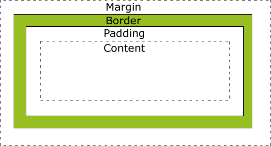
The default height and width is "auto" and makes the element wrap tightly around the contents (preserving padding).
CSS Positioning
Positioning in CSS can be a little tricky, but is very powerful. Browser differences that used to be a major hurdle to good form are starting to improve, making it possible to do a great deal in an elegant way. This section will cover some of the principles of good CSS positioning.
Some additional resources can be found here:
http://www.vanseodesign.com/css/css-positioning/
http://www.tizag.com/cssT/position.php
There are a number of properties that can be used to set position. I'll briefly list some of the most useful ones here and then go over their use in more detail below.
display:
  block
  inline*
  none
  inherit
visibility:
  visible*
  hidden
  inherit
float:
  left
  right
  none*
  inherit
clear:
  left
  right
  both
  none*
  inherit
position:
  static*
  absolute
  fixed
  relative
  inherit
top:
  auto*
  length
  inherit
bottom:
  auto*
  length
  inherit
left:
  auto*
  length
  inherit
right:
  auto*
  length
  inherit
z-index:
  auto*
  [number]
  inherit
In addition, there are common "units" used to set the values of these properties:
px
em
ex
visibility: hidden; Vs. display: none;
The difference between visibility: hidden; and display: none: is whether or not the surrounding elements "save a place" for the element that is being hidden.
For example try the following:
<html>
<head>
  <style type="text/css">
  h1.visible {visibility:visible}
  h1.hidden {visibility:hidden}
  </style>
</head>
<body>
  <h1 class="visible">This is a visible heading</h1>
  <h1 class="hidden">This is an invisible heading</h1>
  <p>Notice that the invisible heading still takes up space.</p>
</body>
</html>
Now change it to:
h1.hidden {display:none}
Notice the elements place is no longer held.
float
The float property sets an element to be a sort of island in the stream.
Give it a try - http://www.w3schools.com/cssref/tryit.asp?filename=trycss_float
Note what happens if you change it to img { float:right; }
or img { float:none; }
Clear
Clear wraps "clear" of a floated element. This is similar to setting the floated element to float:none.
Try it out here - http://www.w3schools.com/cssref/tryit.asp?filename=trycss_class-clear
Position
Position is where things get cool. And also where you can run into trouble. Here are some good sites on the subject:
http://www.vanseodesign.com/css/css-positioning/
http://www.tizag.com/cssT/position.php
The four
basic settings are:
- static - Normal flow
- relative - Alterations relative to normal flow.
- absolute - Removed from the normal flow. Positioned relative to a parent set to "relative".
- Fixed - fixed relative to browser window, independent of scrolling
Try it out here -
http://www.w3schools.com/cssref/playit.asp?filename=playcss_position&preval=fixed
On top of the position property, the top, bottom, left, and right properties can modify the final position of the element. That's to say, that whereever the element was going to show up after position is set, will be altered by some amount.
Try it out here - http://www.w3schools.com/cssref/tryit.asp?filename=trycss_position_top
Putting it all together in an app
In an app you commonly want all your elements to be sized relative to the size of the screen of the device. But device sizes range from tiny to large.
<style type="text/css">
.PosCenter
{
  position: absolute;
  width: 50%;
  top: 50%;
  left: 50%;
  margin-left: -25%;
  margin-top: -25%;
}

<body>
  <img class="PosCenter"
    src="http://produceconsumerobot.com/design_images/front_page_title.jpg" />
</body>

